(no subject)
Jun. 2nd, 2009 10:57 pmSome of you may think that ![[livejournal.com profile]](https://www.dreamwidth.org/img/external/lj-userinfo.gif) kylecassidy is the best photographer in this house. Well, you're probably right. However! Now that philforrest has moved out and assuming trillian_stars and whafford don't have any hidden photography talents (and if they do, I'd thank them to keep it to themselves), I have a good chance at being at least the second-best*. Plus as I used to edit photos for a living, I know my way around Photoshop, at least a little.
kylecassidy is the best photographer in this house. Well, you're probably right. However! Now that philforrest has moved out and assuming trillian_stars and whafford don't have any hidden photography talents (and if they do, I'd thank them to keep it to themselves), I have a good chance at being at least the second-best*. Plus as I used to edit photos for a living, I know my way around Photoshop, at least a little.
Look! Turtles!

So you see here I kicked up the contrast, punched up the yellow highlights and blue shadows, then did a very subtle "spotlight" burn to focus the eye on the cranky, cranky face. I came close to making it look like it was taken in artificial light by making the light too white, but I think punching the contrast as much as I did really brings out the depth in the wrinkles of the shell.


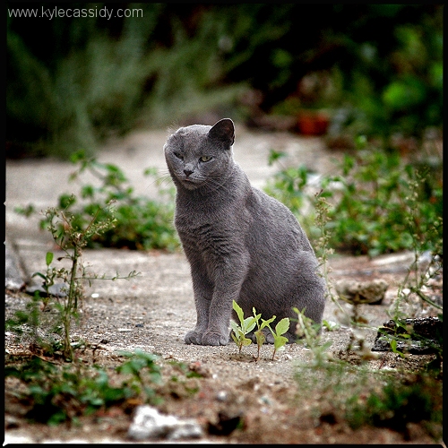
Here the changes are more obvious -- big kick in the contrast, big bump in overall color saturation and I nudged the yellow and green highlights, plus a big ol' not-as-subtle spotlight burn.

I had actually done a version using a burnt-corner effect...

... an effect which I may have lifted from someone I mentioned earlier, but ultimately decided against it. Which do you think looks better?
What do you think?
*Maybe third**.
**OK, OK, possibly fourth.
Look! Turtles!
So you see here I kicked up the contrast, punched up the yellow highlights and blue shadows, then did a very subtle "spotlight" burn to focus the eye on the cranky, cranky face. I came close to making it look like it was taken in artificial light by making the light too white, but I think punching the contrast as much as I did really brings out the depth in the wrinkles of the shell.
Here the changes are more obvious -- big kick in the contrast, big bump in overall color saturation and I nudged the yellow and green highlights, plus a big ol' not-as-subtle spotlight burn.
I had actually done a version using a burnt-corner effect...
... an effect which I may have lifted from someone I mentioned earlier, but ultimately decided against it. Which do you think looks better?
What do you think?
*Maybe third**.
**OK, OK, possibly fourth.